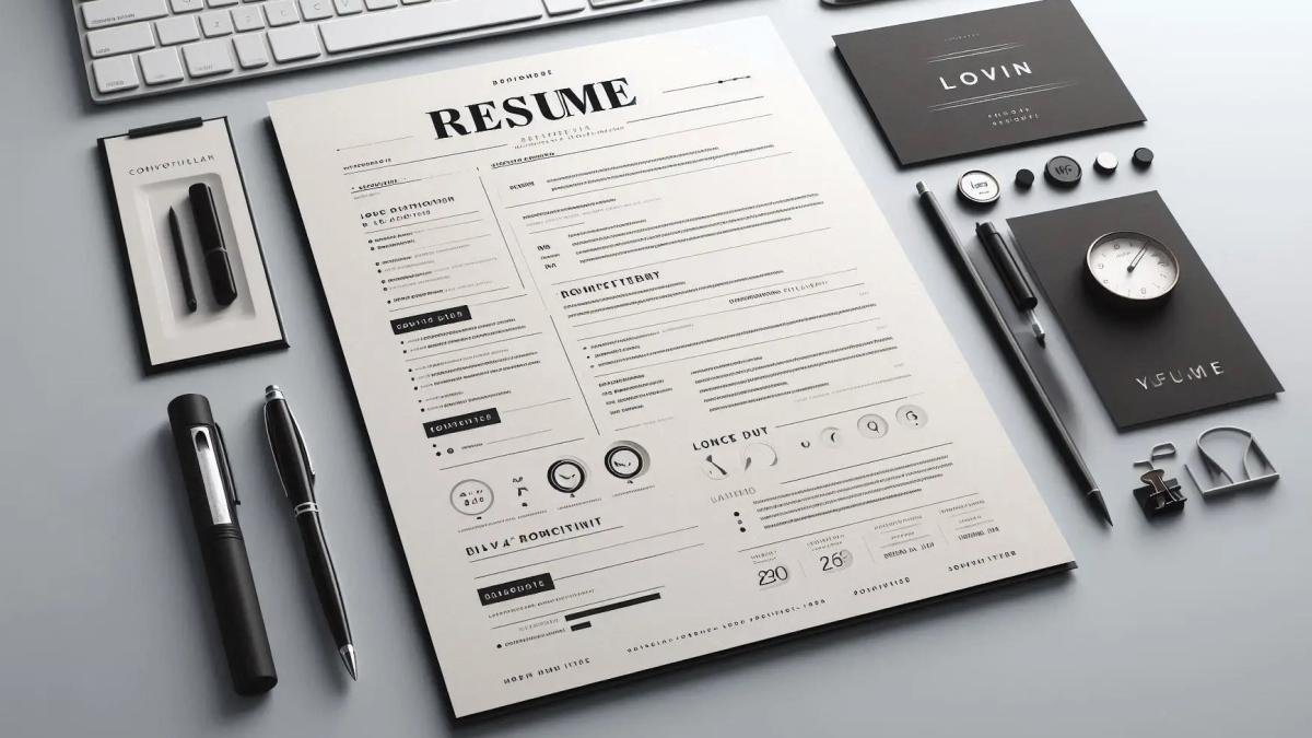
Resume Typography: How Fonts Can Impact First Impressions
Nov 12, 2024. By Admin
When it comes to resume writing, every detail matters. Typography, or the art and technique of arranging type, plays a significant role in creating a first impression. The right font not only makes a resume visually appealing but also subtly influences how hiring managers perceive a candidate’s professionalism, personality, and attention to detail. In this article, we’ll explore how font choices impact hiring decisions, the psychology behind different font styles, and which fonts align best with modern resume design trends.
The Psychology of Fonts in Resumes
Fonts carry distinct personalities and can evoke subconscious reactions in readers. For instance, a font like Times New Roman may project a sense of tradition and reliability, while a clean, modern font like Calibri can communicate professionalism and clarity. Understanding the psychology of typography can help job seekers select a font that not only aligns with their personal brand but also resonates with the expectations of hiring managers.
-
Serif Fonts (e.g., Times New Roman, Garamond): Serif fonts are often seen as classic and trustworthy. These fonts have small lines or "serifs" at the ends of letters, adding a sense of formality and tradition. For conservative industries like law or finance, serif fonts can convey credibility and stability, qualities that are often valued in these fields.
-
Sans Serif Fonts (e.g., Arial, Calibri): Sans serif fonts, which lack the small lines at the ends of letters, offer a clean, modern appearance. These fonts are generally easier to read on screens, making them ideal for industries that value digital literacy, innovation, or a contemporary approach. Sans serif fonts are widely used for resumes, especially in fields like tech, marketing, and design, where simplicity and clarity are highly appreciated.
-
Script and Decorative Fonts (e.g., Brush Script, Comic Sans): While these fonts can add personality, they are typically avoided on resumes due to readability issues and a lack of professionalism. Decorative fonts can be distracting and may even convey a casual attitude, which is generally not suited to most professional settings. However, in creative fields where self-expression is valued, a tasteful script font could be strategically used in headings or names.
The Impact of Font Choices on Hiring Decisions
Research suggests that font choices can subtly influence hiring managers’ perceptions and decisions. Here’s how typography can impact how you’re perceived:
-
Professionalism and Attention to Detail: Fonts like Calibri or Arial are straightforward and clean, indicating a well-organized individual who pays attention to detail. A cluttered or overly stylized font may imply a lack of focus or professionalism.
-
Personality Fit: While resumes are largely about showcasing skills and experiences, subtle aspects like font choice can suggest personality traits. A candidate applying for a creative role might opt for a slightly more unique, contemporary font, whereas one applying for a finance position might stick to a more traditional typeface.
-
Readability and First Impressions: The readability of a resume can have a direct impact on hiring decisions. Busy fonts can make information harder to scan, frustrating hiring managers who may spend mere seconds on each resume. Clean, readable fonts keep the focus on content, not on deciphering the text.
Best Resume Fonts for 2024
With a balance of readability and style, certain fonts have proven to work best on resumes. Here are some recommended choices that align with resume design trends:
-
Calibri: Clean, modern, and universally recognized, Calibri is a top choice for resumes in any industry. Its neutral appearance ensures it doesn’t distract from the content.
-
Garamond: A classic serif font, Garamond is known for its elegant and sophisticated style. It’s a great choice for traditional industries or senior-level roles.
-
Helvetica: Known for its readability and modern look, Helvetica suits a variety of roles, especially those in tech or creative fields. Its balanced design is both eye-catching and professional.
-
Arial: As one of the most widely used fonts, Arial is safe, clean, and familiar to readers. It’s ideal for job seekers who want a no-frills, straightforward look.
-
Georgia: A slightly more stylized serif font, Georgia combines professionalism with readability. It’s a good option for candidates seeking a mix of traditional and contemporary aesthetics.
Resume Typography Tips
Selecting the right font is just one part of creating an impactful resume. Here are some additional typography tips to ensure your resume stands out for the right reasons:
-
Font Size: Keep font sizes between 10-12 points for body text, and slightly larger for headings. This ensures readability without overwhelming the page.
-
Consistent Formatting: Use the same font throughout the document to maintain a cohesive look. Differentiating headings with a bold or slightly larger version of the same font can create a clean, organized appearance.
-
Whitespace and Line Spacing: Proper use of whitespace and line spacing can make your resume easier to scan. Avoid cramming too much text; instead, allow room between sections for better readability.
-
Avoid Over-Styling: Reserve bolding, italics, and underlining for emphasis, but use them sparingly. Over-styling can clutter the resume and reduce its professionalism.
-
Test on Multiple Devices: If submitting your resume digitally, check how it appears on different devices. Fonts may render differently across platforms, so ensure readability is maintained regardless of screen size.
Why Font Choice Matters in Resume Design Trends
With increasing competition in the job market, staying updated with resume design trends can give job seekers a competitive edge. Fonts are evolving alongside design trends, and hiring managers now expect resumes that are both visually appealing and easy to read. By aligning your resume with current typography trends, you show an awareness of modern aesthetics and the value of presentation in professional documents.
Incorporating Professional Assistance with CV Designer
If you’re ready to take your resume to the next level, consider working with a professional service like CV Designer. CV Designer specializes in creating resumes for senior leaders and adapting formats specifically for the Australian job market. With an expert understanding of typography and design trends, CV Designer ensures that your resume uses effective fonts and a layout that appeals directly to hiring managers. Investing in a professional resume can make all the difference in landing a role, particularly in competitive industries where presentation matters. From selecting the right "resume format" to highlighting your accomplishments with strategic "resume words," CV Designer is committed to creating documents that make impactful first impressions. Place your order today to gain a distinct advantage with a resume tailored for success.


ADD COMMENTS
Your email address will not be published. Required fields are marked *